Project Overview
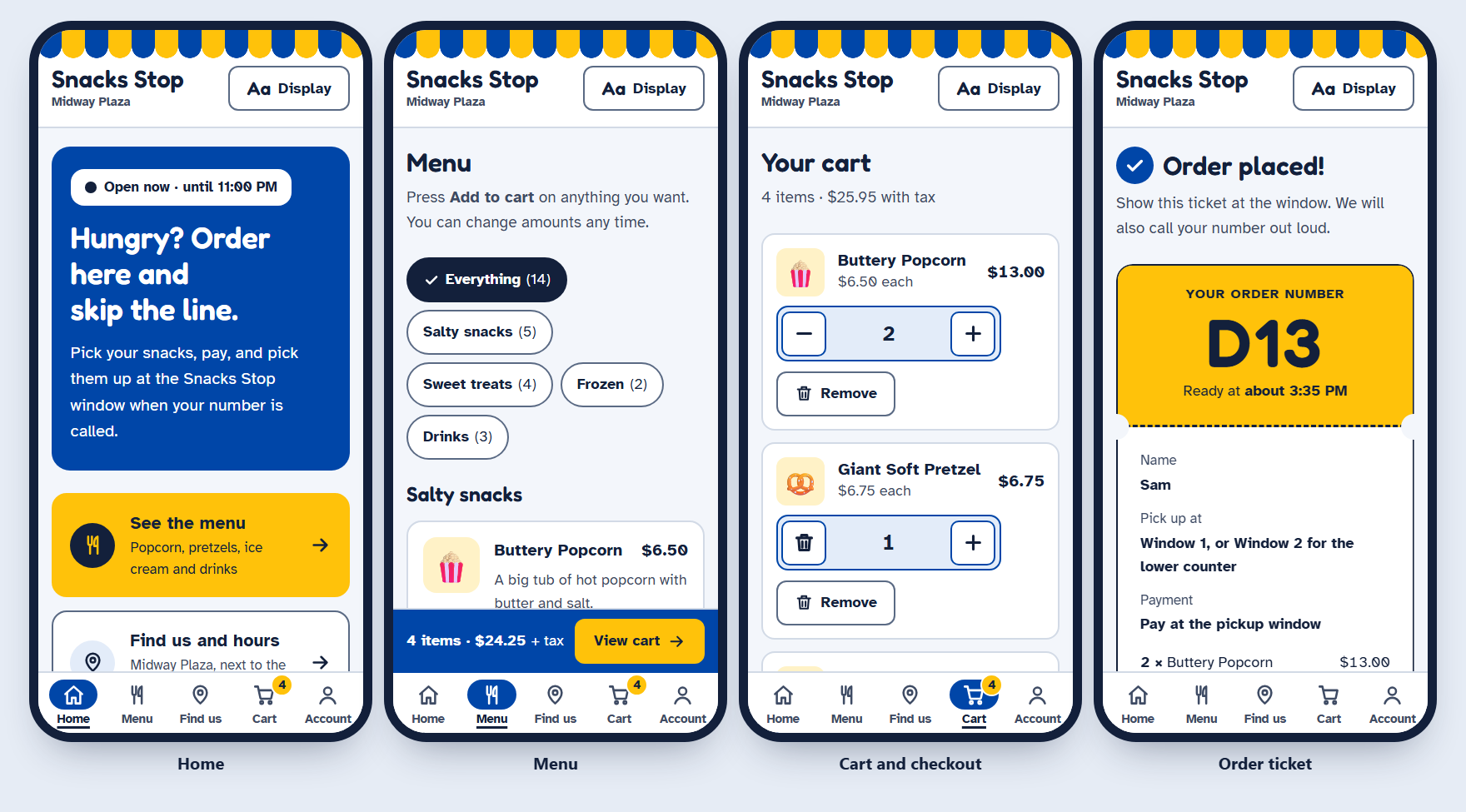
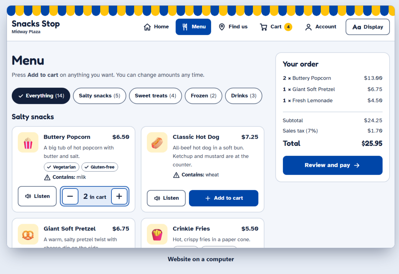
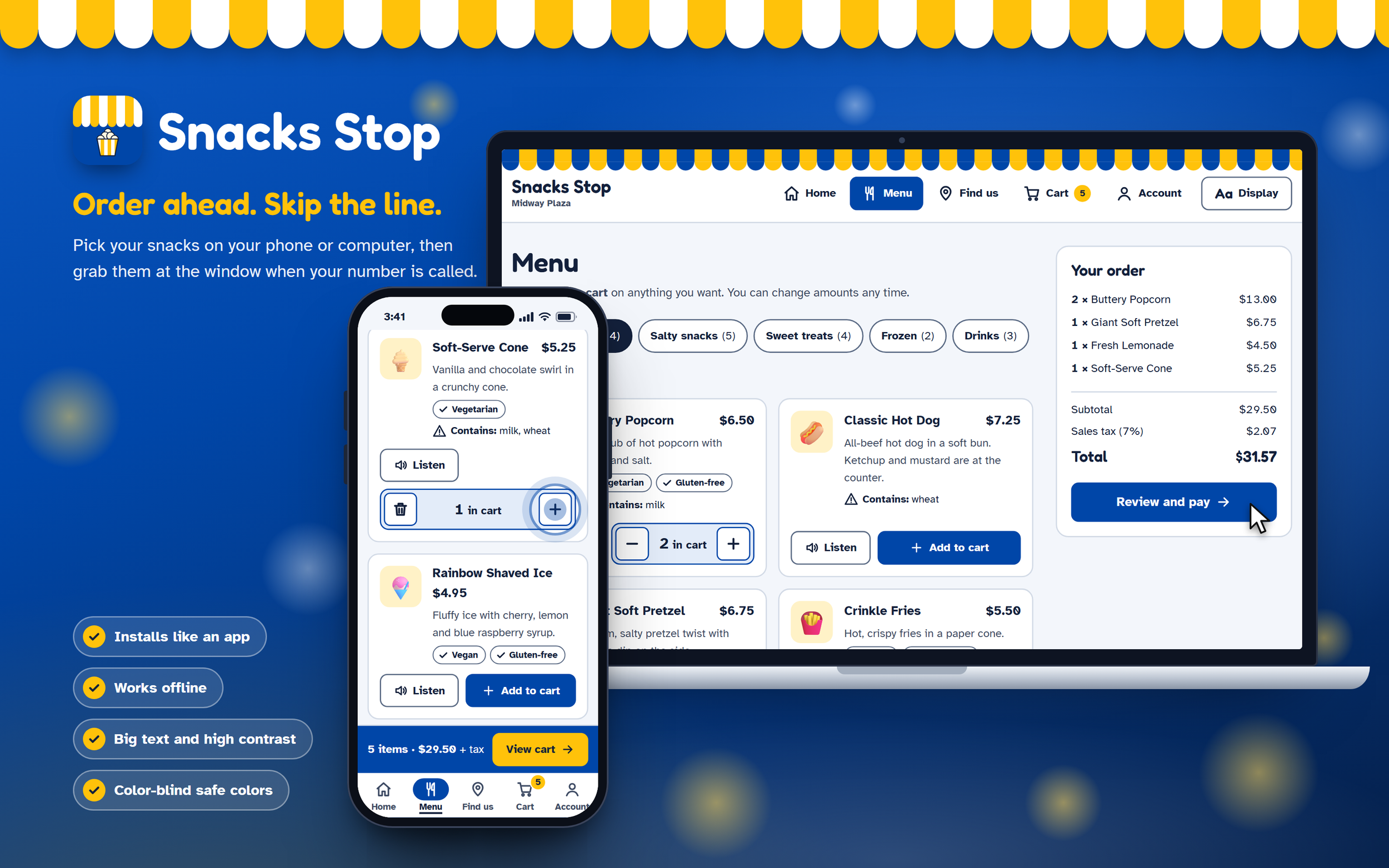
Snacks Stop is a snack-ordering app for a theme park stand: guests pick snacks, pay, and collect them at the window with an order number. It started as a Figma wireframe and is now a working website and an installable app, built so guests of any age or ability can order on their own.
UX/UI Designer
My Role
Goals and Audience
The goal is that any guest can order snacks ahead without help, then pick them up with a clear order number instead of waiting in line.
All ages: young kids who read little, older guests, and first-time visitors.
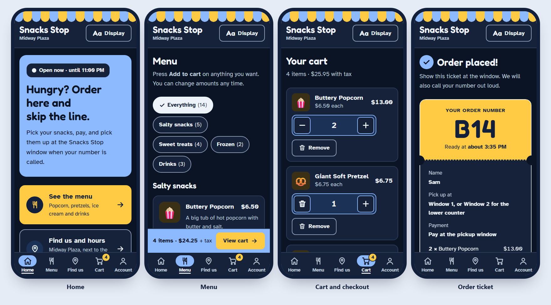
Disabilities: low vision, color blindness, shaky hands or limited reach, screen reader users, and people bothered by motion on screen.
Starting point: the Figma file "Snacks Stop", with paper sketches and five wireframe screens (Home, Location/Hours, Menu, Account, Checkout).
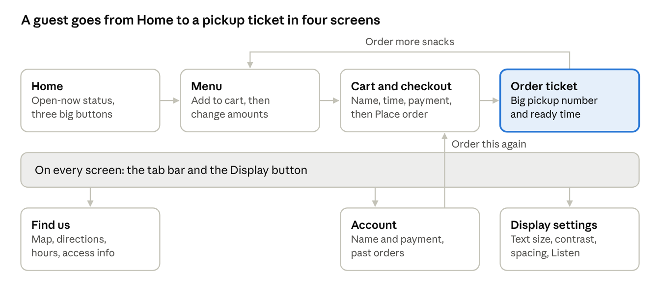
Two changes from the wireframe matter most. The hamburger menu became an always-visible bottom tab bar with words under each icon, because hidden menus are harder for older guests and people with memory or attention difficulties. The design also gained a pickup ticket screen, a cart badge, past orders and display settings.
Planning/Research
My mission was to design a mobile app for a smaller amusement park snack station—something simple, accessible, and convenient for guests of all ages. Smaller amusement parks often face long wait times at snack stations, leading to frustration and reducing the amount of time visitors can spend enjoying rides. Unlike major theme parks with advanced mobile-ordering platforms, smaller parks typically lack digital tools that support quick food ordering, clear menu access, and accurate location and hours information. Users need a convenient, user-friendly solution that allows them to order snacks ahead, check hours, and easily find the stand without interrupting their experience. This challenge created an opportunity to design an app that improves efficiency, reduces wait times, and enhances the overall guest experience.
The goal was to create an experience where users could browse the menu, place an order ahead of time, check the stand’s location, and view operating hours—all in a clean, intuitive interface. By allowing guests to order while waiting in line for a ride, the app helps reduce downtime and maximize enjoyment throughout the park.
To inform my approach, I conducted research by exploring how larger amusement parks manage their mobile food-ordering systems. I reviewed apps and websites from Disney World, Universal Studios, and Six Flags, paying close attention to what each platform offered and how their features differed. This comparative research helped me identify opportunities for improvement and guided me in designing a solution that feels intuitive, straightforward, and user-friendly for a wide range of ages and tech comfort levels.

To begin the design process, I focused on outlining the user flow to understand how someone would naturally move through the app. Starting with low-fidelity sketches allowed me to explore ideas quickly without getting distracted by visual design too early. At this stage, the goal was speed, clarity, and experimentation—ensuring that every step in the user journey felt logical and intuitive.
Once the user flow felt solid, I transitioned into creating wireframes. This phase helped me refine the structure of each screen, including layouts, navigation patterns, and content hierarchy. I mapped out how pages connected, what each button led to, and how the user would interact with different elements across the interface.
These wireframes served as the backbone of the project. They established a clear framework that supported future iterations and made it easier to introduce additional tools, visual elements, and interactive components later on. By building a strong foundation early, I ensured the rest of the design process would be more efficient, organized, and intentional..
Wireframe
High-Fidelity
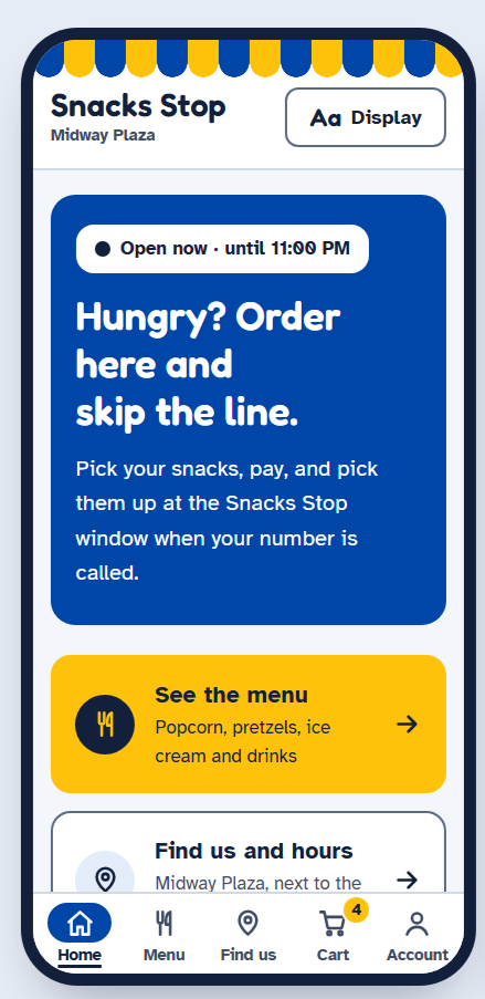
Snack Stop is a mobile application designed to streamline the snack-ordering experience in theme-park and fair-style environments. The final product features an intuitive interface with a visually engaging menu, vibrant imagery, and simple navigation. Users can browse the full snack selection, view location and hours, and place orders ahead of time directly from their phone. The app is optimized for convenience, allowing guests to order while waiting in line for rides, reducing wait times, and enhancing the overall park experience.
The finished app includes:
A clean, scrollable menu with categorized items
Interactive buttons for Menu, Account, and Location/Hours
A playful, colorful design aligned with the theme-park aesthetic
Smooth navigation and user-friendly layout